The Typography Exhibition Prepared by the Students of the Department of Visual Communication Design Awaits Its Visitors
8 YEAR(S) AGO
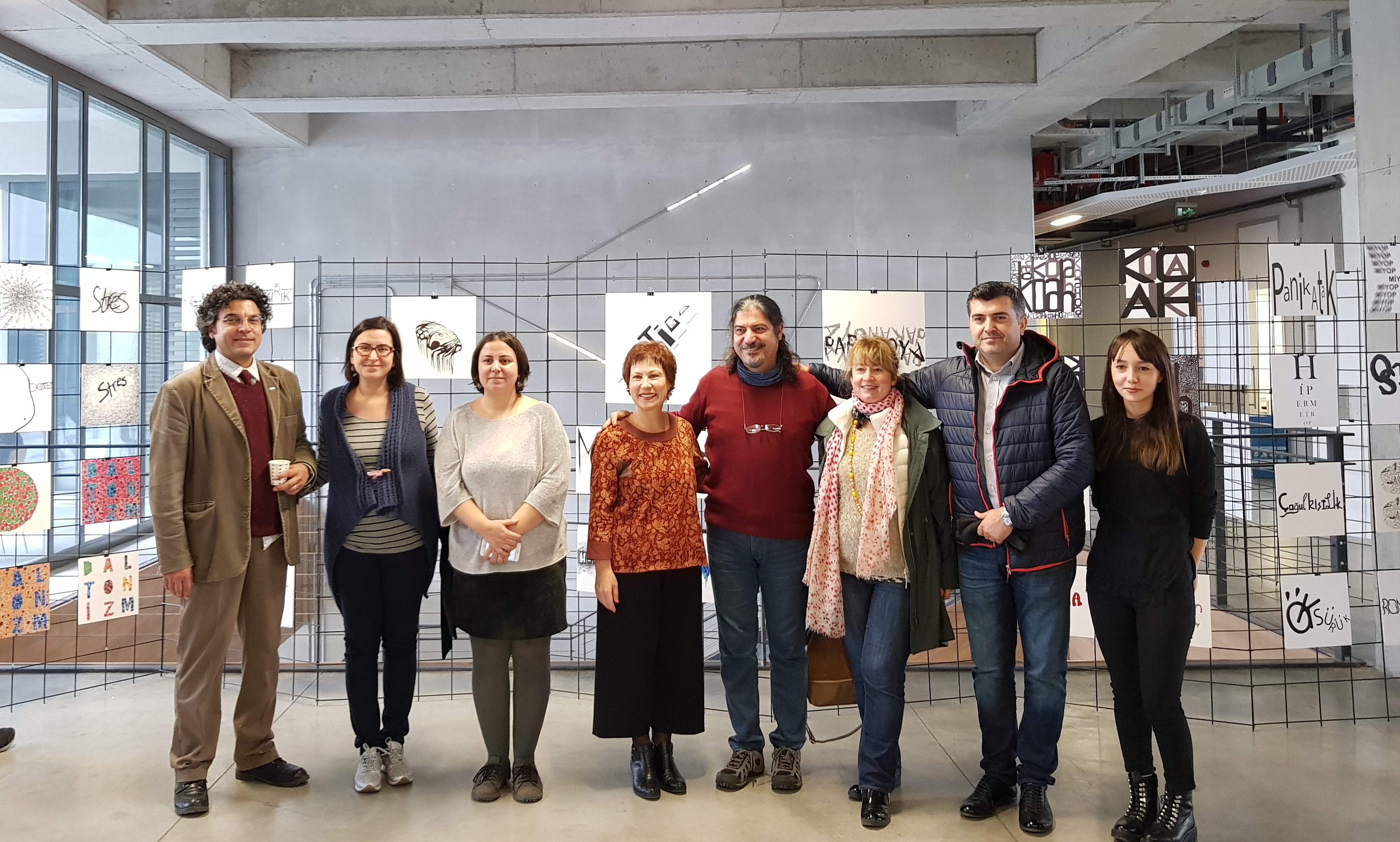
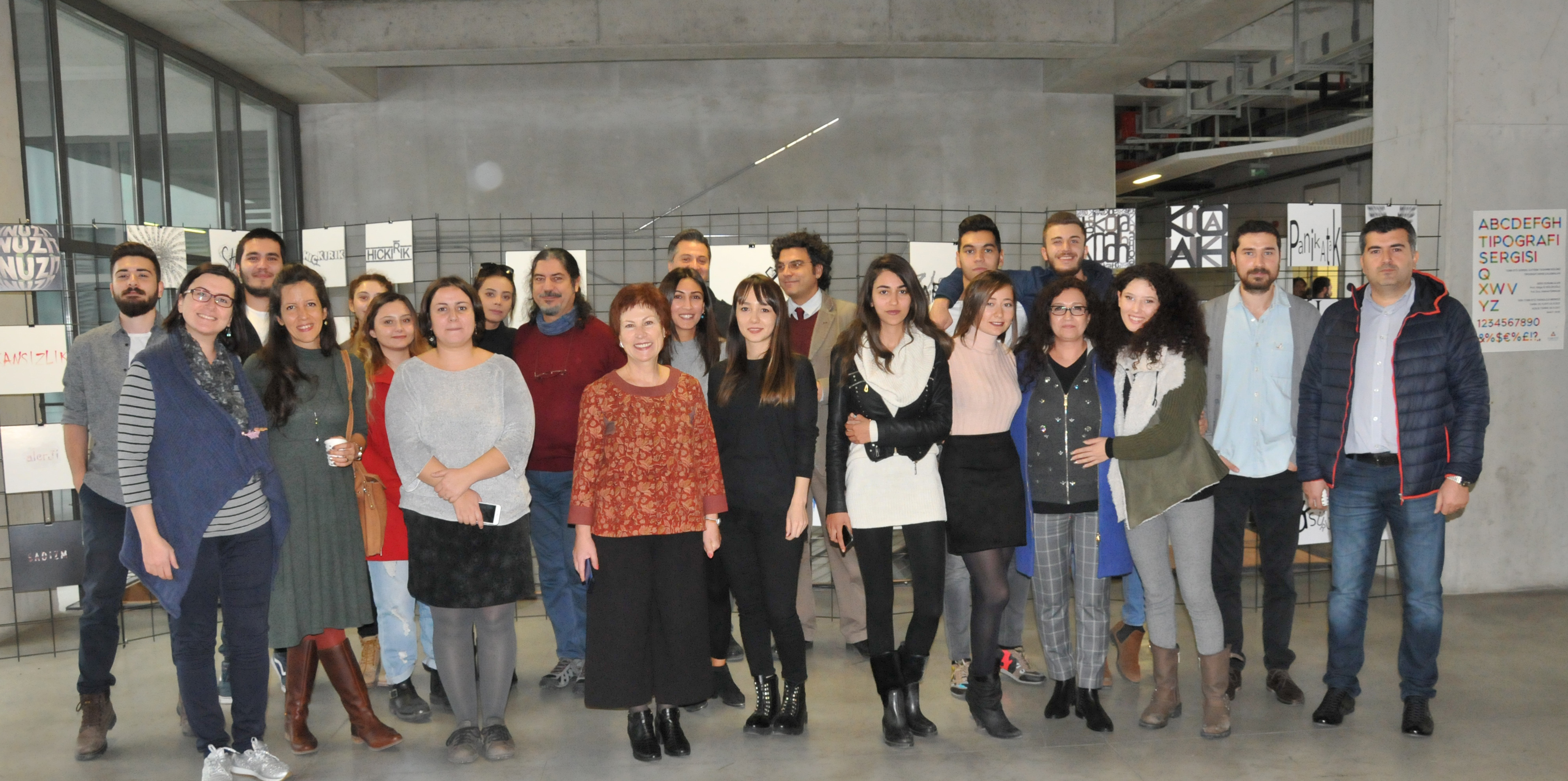
The exhibition, where the works created by the second grade students of the Department of Visual Communication Design as a part of their Typography course are exhibited, was opened on November 6, 2017. The information provided by Prof. Dr. Hülya İz Bölükoğlu about the exhibition, which will be awaiting its visitors at the 3rd floor of the Technology Center until November 24, 2017, is as follows:
As a famous designer put it;
It must be possible to hear typography.
It must be possible to feel typography.
It must be possible to experience typography.
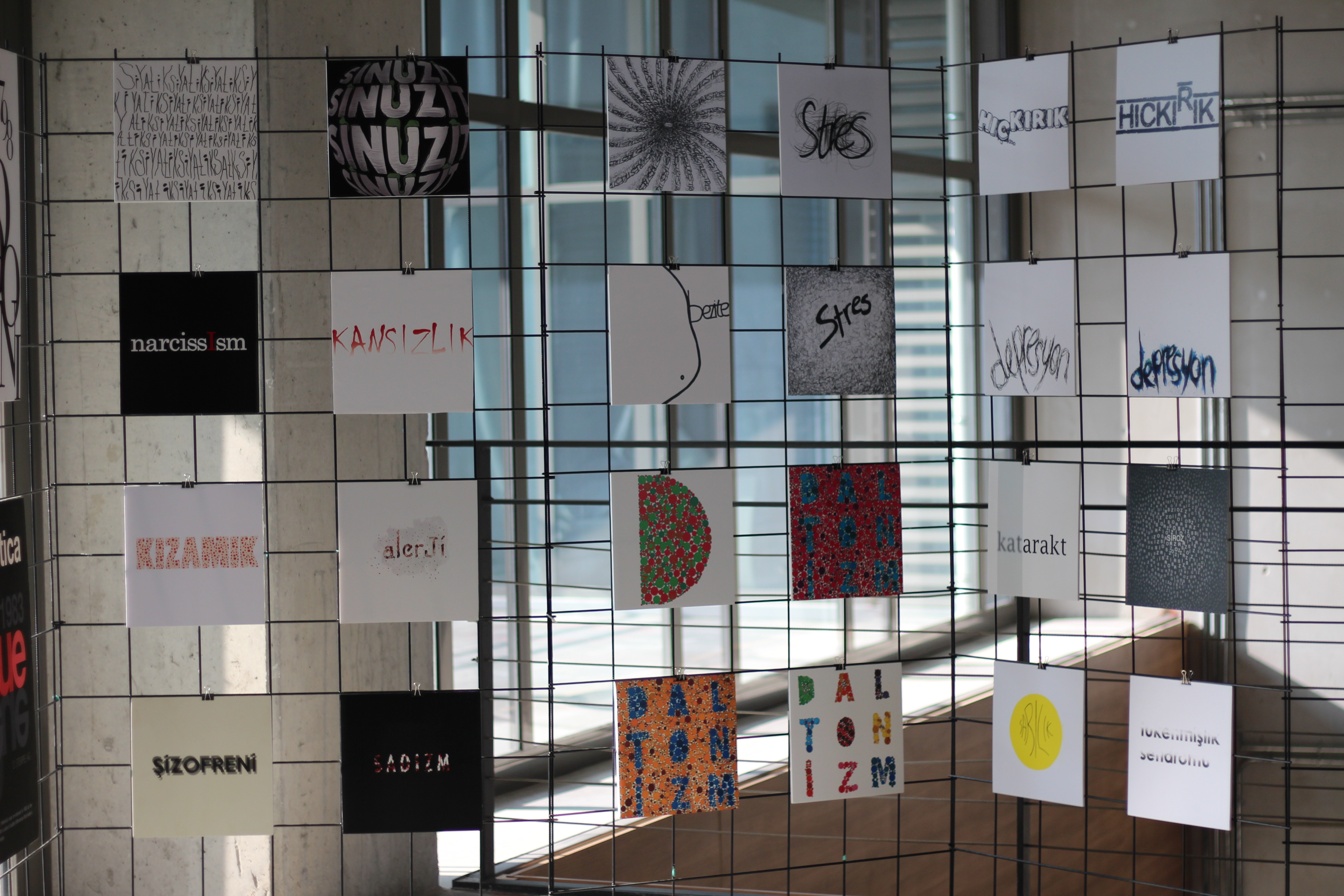
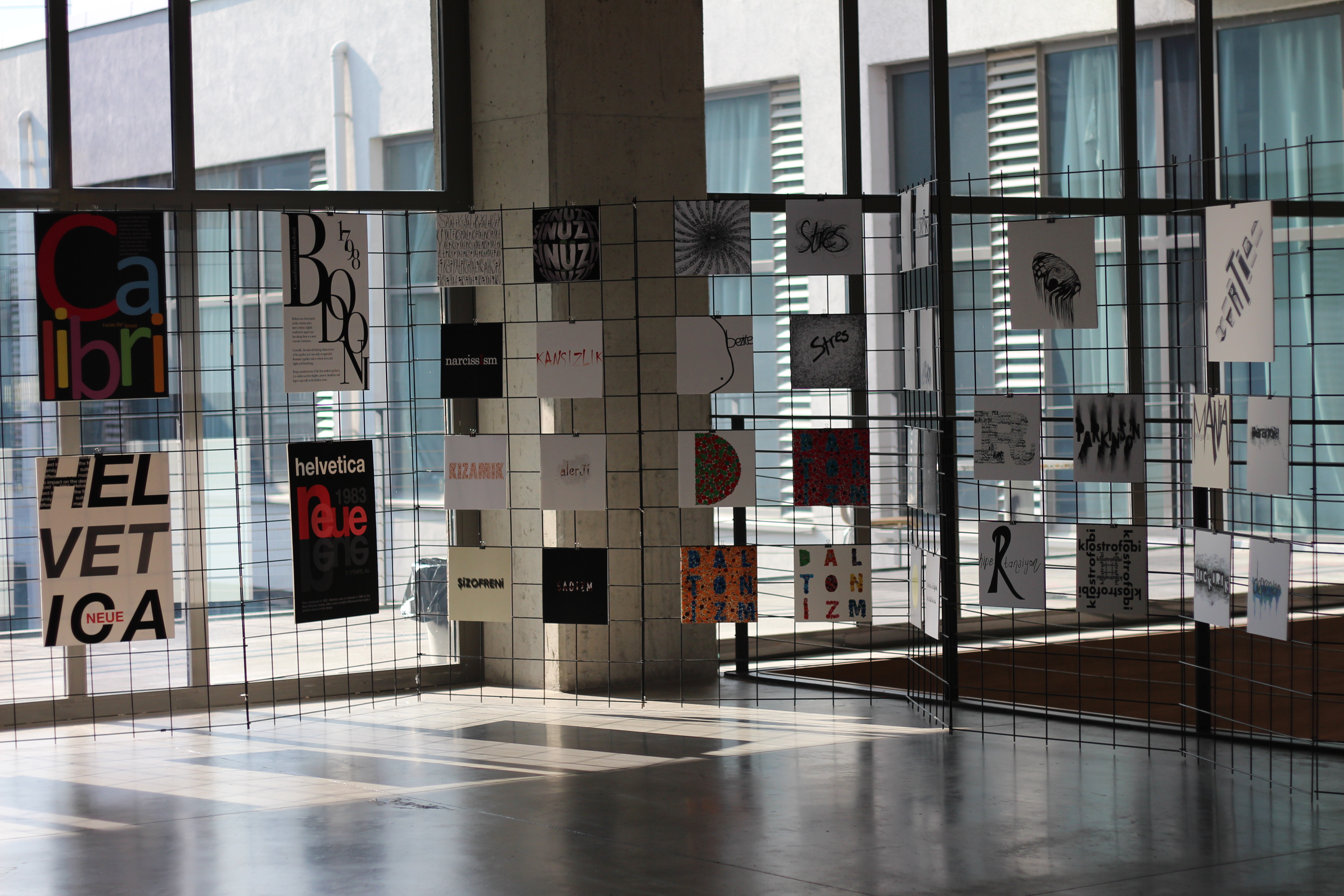
This exhibition is comprised of the works created by the second grade students of the Department of Visual Communication Design.
Lecturers of the course: Prof. Dr. Hülya İZ BÖLÜKOĞLU and Assistant Prof. Dr. Halime TÜRKKAN.
In this course, initially, the fundamentals of Typography have been addressed. Information has been given about the anatomy, color, size and legibility of font, the hierarchical use of script in designs, the world-famous fonts, the effects of the same as well as the designers of the same, and an abundance of visual samples and designs were shown and videos were displayed.
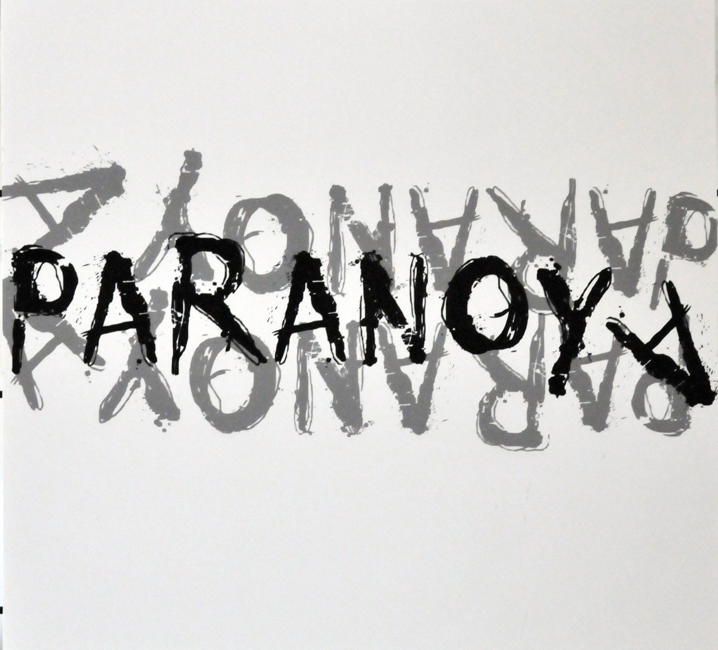
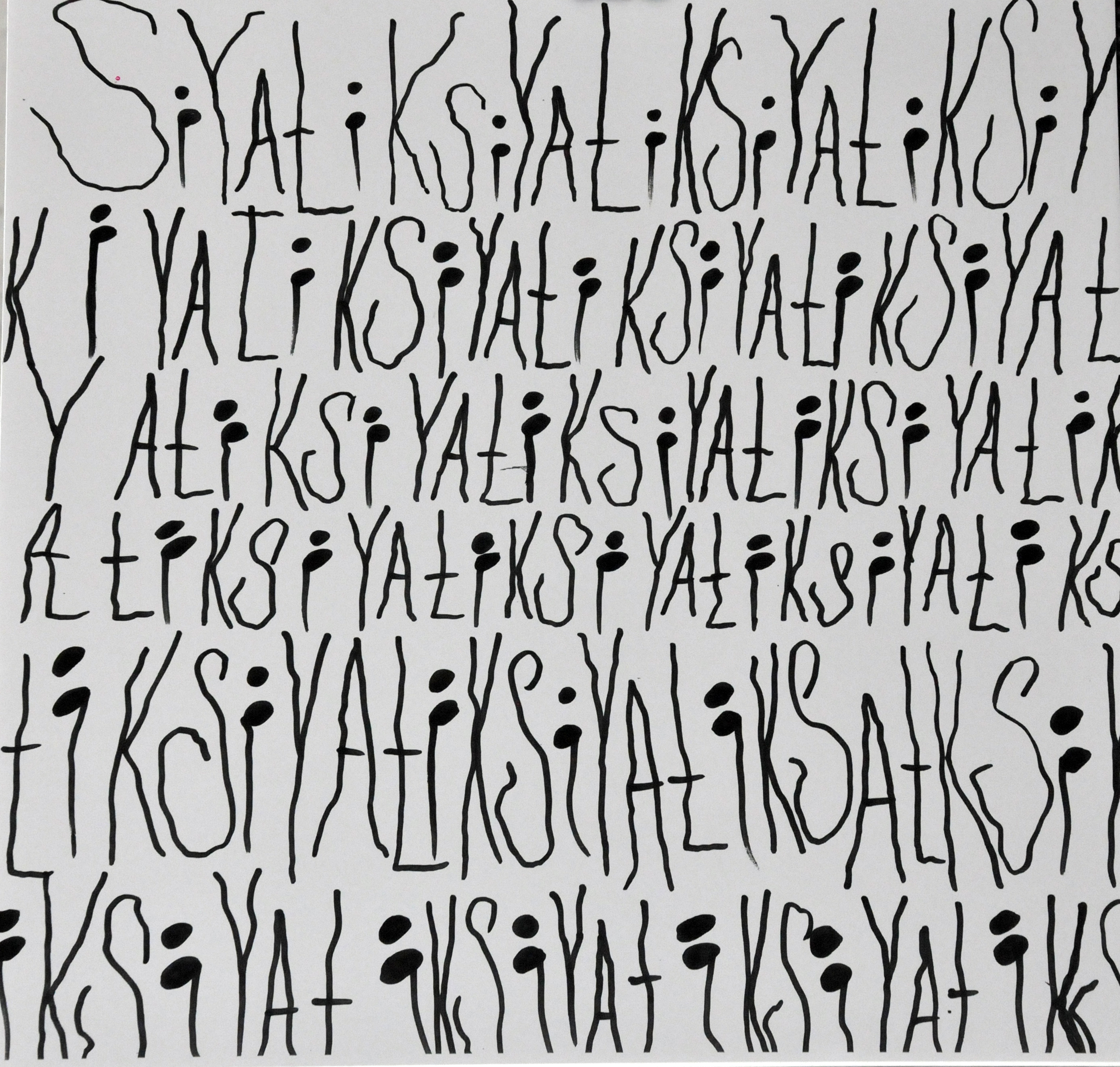
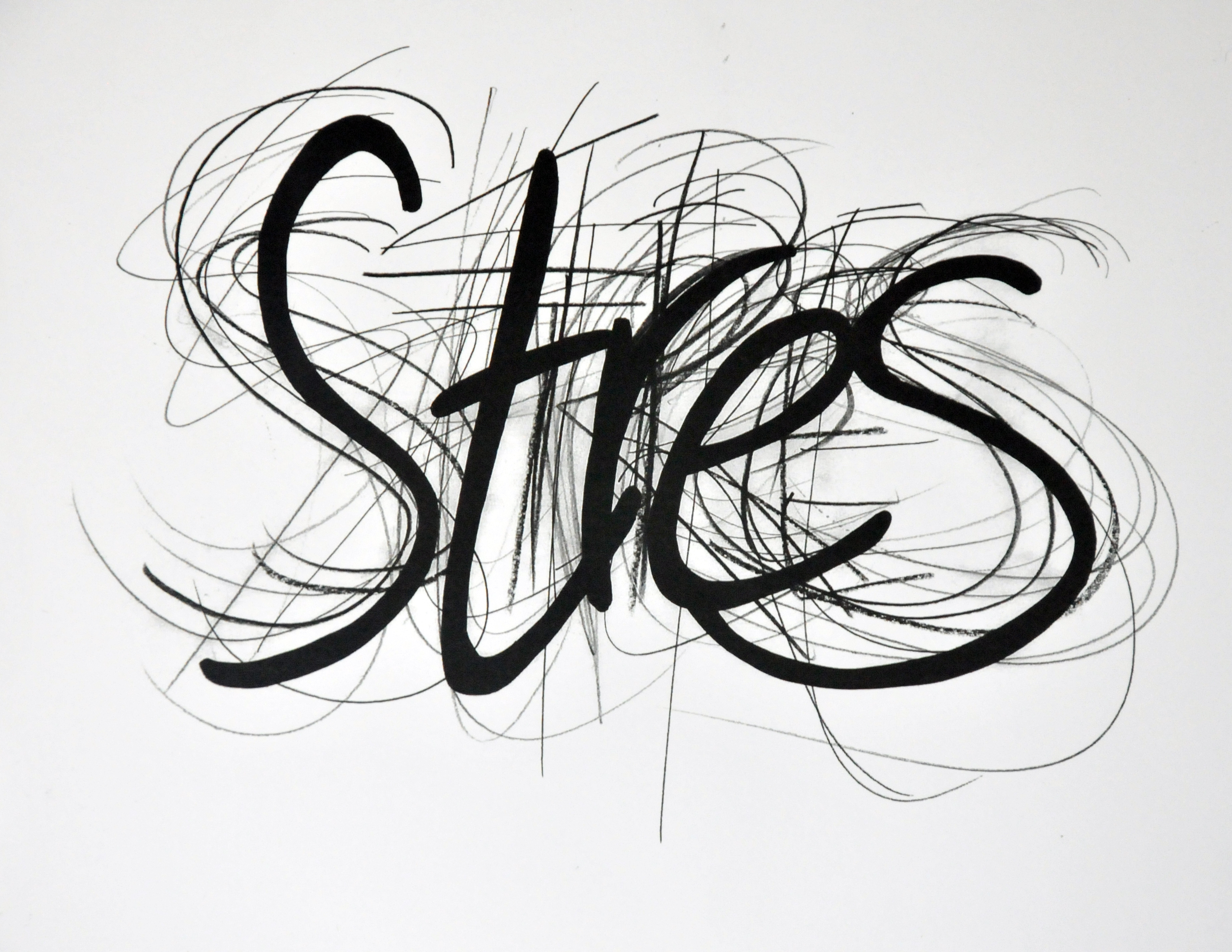
Two project endeavors were conducted as a part of the practical pillar of the course. Once of those endeavors was about the typographical design of the symptoms, pains and aches of diseases. At the first stage, the students studied the diseases and, considering the characteristics of a selected disease, made exercises as to how they can describe and depict such disease merely by writing its name.
A good Typographic design is such that can describe you what need to be said, and that can depict the pain and the joy in the plainest manner.
Similarly, the purpose of our studio exercise is to be able to describe and evoke the characteristics of a disease by way of a single word only. The students were instructed to use only letters and no other visual elements in their designs.
What matters here is to be able to make the audience to feel the symptoms of the disease, to create the impression on the audience that the design reflects not a script but the person, who suffers from such disease, and the troubles caused by the same.
For instance; a typographic design of Copd must be able to make us feel the sense of congestion and inability to breath, which a person, who suffers from such condition, experiences.
.jpg)
Likewise, a typographic design of vertigo makes you feel dizziness and loss of balance, being the symptoms of the disorder. It is as if the lower part is positioned upward, as if there is a defect with the perspective, as if you could fall any moment...
The student has endeavored to depict such characteristics of the disorder, drawing the letters through varying perspectives in her/his design.
.jpg)
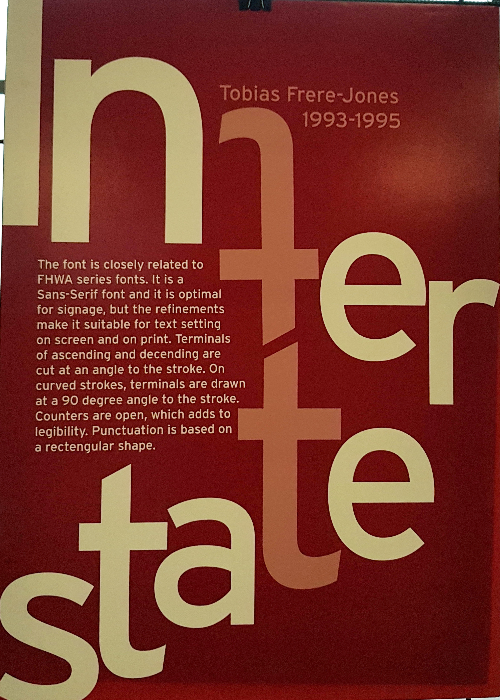
At the second stage of the project; each student examined various fonts, and conducted research about when and by which designer such fonts were invented, and where and and for what purpose they were used as well as their effects and legibility, and prepared a file that contained all such relevant information and visuals so gathered. The students, then, designed typographic placards that contained the characteristics of and the relevant information of such fonts.
.jpg)
We hereby thank Prof. Dr. Hülya Iz Bölükoğlu for the information.
News Story Credit: Şule Demir – Department of Psychology